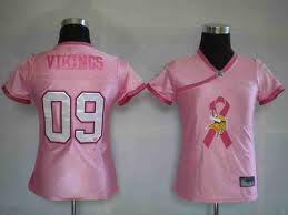
Pink Movement
The color pink has long been a favorite color for many girls. It is now growing to be a favorite color for many people and a lot of products as well, as pink is the representative color for the fight for breast cancer!
Images
This is my sorority logo/brand. It was recently updated in 2008 to capture the true meaning of what Alpha Chi Omega women are. It is a very literal message when looking at the whole message. However, the lyre is used by itself sometimes, and unless you knew that was Alpha Chi Omega’s symbol it would not be very self-explanatory. The lyre is my favorite part. Our old lyre was very cartoonish, and not very visually appealing. To me, this lyre was very well designed and can go from fun to elegant depending on the colors and context used. I like it because it means a lot to me. I’m very involved in my sorority, and know that this will always be apart of my life.
This is picture I took of my snowboard. I absolutely love the graphics on it, and that was the deciding factor in my purchase decision. I love France and the Marie Antoinette period in which these graphics embody. I wanted to find a snowboard that was feminine without being all flowery and covered in hearts. I was very happy when I found this board, and thrilled that it was a good brand as well. To me there isn’t really a meaning behind it. But everyone is different and I guess someone could see a meaning in this if they really wanted to.
I want to get into advertising, and I love ads that are exciting to look at. This ad is very fun and girly, which is okay because it’s advertising perfume. What makes it great though, is the text being thrown across. This ad is heavily reliant on the text, because with out it one would not know what brand it was. I love the way the stamp in the upper left corner was designed too.
The Nike swoosh is iconic. There are not many people who would see that symbol and not know what it stood for. I love it because it is so simple but it gets the message across. In advertising the simpler the better, because you can do a lot with it and it’s cost effective. The logo seems very self-explanatory to me, but who knows there may be someone who doesn’t get it.
Again this logo is very simple, but simple is elegant; especially when it comes to high fashion. This logo is so great because they can embed it into so many things that they create with it looking great. I personally know what it stands for, and Im sure most women do. However a man with no interest in fashion would look at this and have no idea what it was or what it meant.
What I truly love about this logo is its evolution over time. It started out brown, the mermaid was very different looking and not very visually appealing. But they modernized her, threw a splash of color in, and now it’s the logo that everyone looks forward to seeing in the morning.
Hello world!
Welcome to WordPress.com. This is your first post. Edit or delete it and start blogging!


